Naomi Lewis Parenting Coach

I created this concept branding and website project for a parenting coach who helps parents of young children move from chaos to calm. The goal was to create a visual identity and online experience that communicates trust, warmth, and structure combining gentle aesthetics with clear, conversion driven design.

About the Project

This concept branding and website design project was created to demonstrate how strategic design can visually communicate emotional transformation for coaching brands. Focused on a parenting coach who helps parents of young children move from chaos to calm, the project explores how color, typography, and layout can convey trust, structure, and empathy. The goal was to build a visual identity and online experience that feels grounded and supportive while guiding users clearly toward action — reflecting the same calm confidence Naomi helps her clients create at home.

The Vision

The vision behind this project was to create a brand and digital presence that embodies the emotional transformation Naomi facilitates for her clients — helping parents move from chaos to calm. The brand needed to feel grounded, trustworthy, and nurturing while maintaining a sense of quiet confidence and professionalism. Every design decision — from the soft color palette and spacious layout to the tone of the copy and flow of the user journey — was made to communicate ease, emotional safety, and clarity. The result is a brand system and website that mirror Naomi’s mission: to empower parents to show up calmly and confidently for themselves and their children.

The Visual Identity

The visual identity for Naomi Lewis – Calm Parenting was designed to convey calm confidence through a balanced palette of light and dark blues. The lighter tones evoke peace and openness, while the deeper shades bring a sense of trust and grounded authority, together reflecting the calm strength Naomi helps parents cultivate. A clean, modern sans serif type system reinforces clarity and approachability, creating a professional yet gentle tone. Paired with generous white space and minimal design elements, the overall identity feels structured, soothing, and trustworthy, a visual representation of Naomi’s mission to guide parents from chaos to calm.

The Website

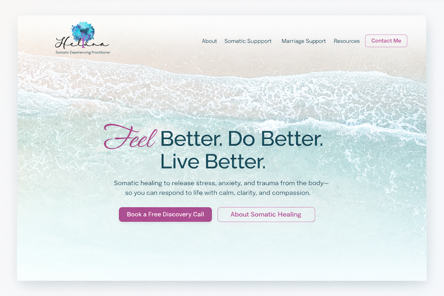
The website was designed to feel calm, structured, and easy to navigate. Every element supports the user’s emotional journey, from the gentle blue and blush color palette to the open layout and intuitive flow. The homepage immediately establishes trust with a clear transformation statement and welcoming portrait of Naomi, followed by concise sections that introduce her story, outline her offers, and share client testimonials. Subtle animations and spacious design create a soothing rhythm, while strong calls to action guide users naturally toward booking a discovery call. The result is a digital experience that feels supportive, grounded, and designed to help parents feel at ease from the very first click.

Why It Matters

This project demonstrates how intentional design can translate emotional transformation into a tangible brand experience. Design is about more than aesthetics, it’s about building trust through clarity, warmth, and structure. For a parenting coach whose clients often arrive feeling overwhelmed, every color, word, and layout choice helps communicate safety and confidence. By aligning the brand’s visual language with its core message of “from chaos to calm,” this project shows how thoughtful design can deepen connection, improve user experience, and ultimately help a service-based business convey its true impact online.

Ready to Reflect the Depth of Your Work?

If this project resonates and you’re ready to align your brand and website with your message and mission — I’d love to help.